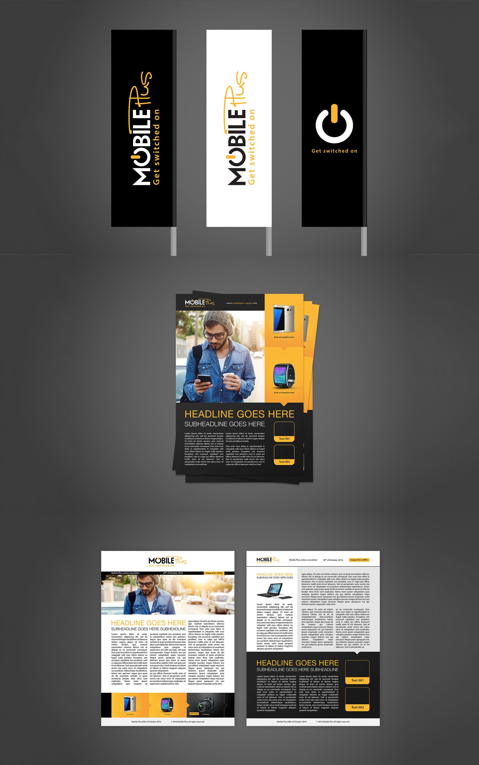
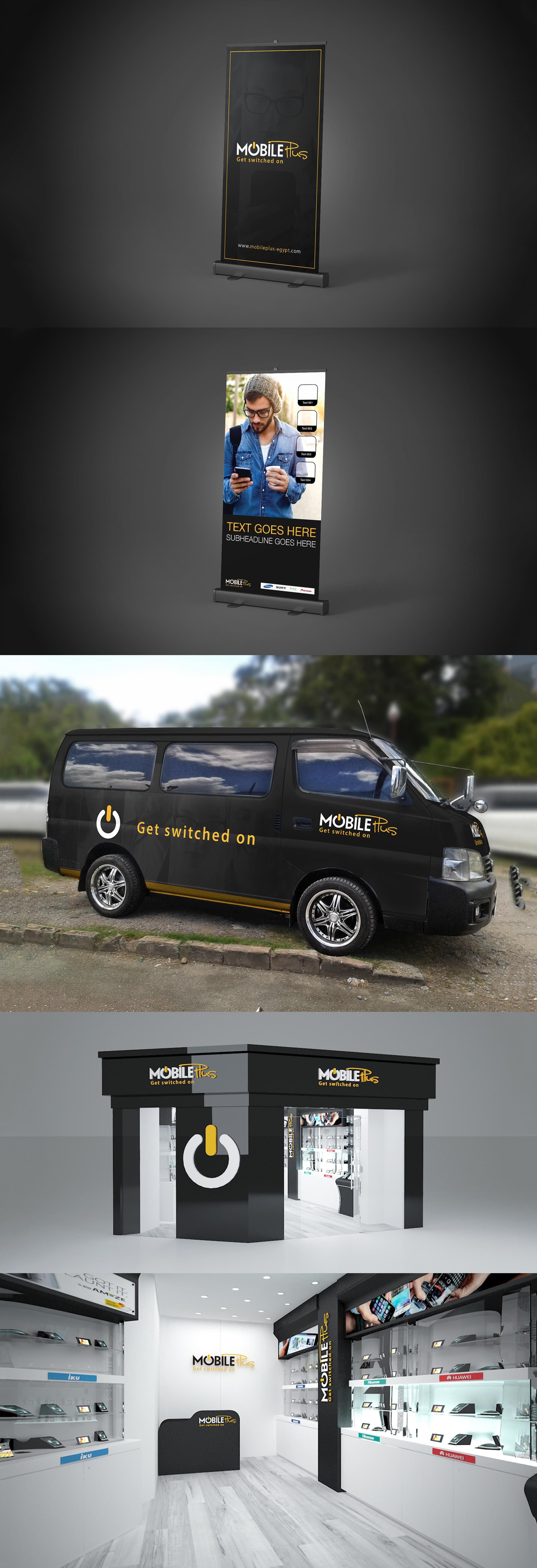
Mobile Plus is a private corporation established late 2010 in Egypt, which is the largest market in MENA region. They started with mobile phones trade and became an Authorized Reseller for Apple, Hisense & IKU Products.
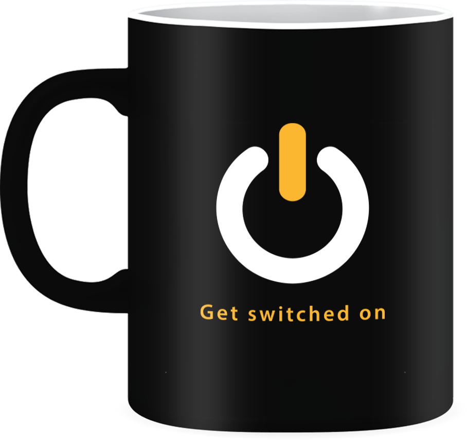
“GET SWITCHED ON” -MobilePlus
You couldn’t turn a blind eye to all the technological advancements even if you tried to.
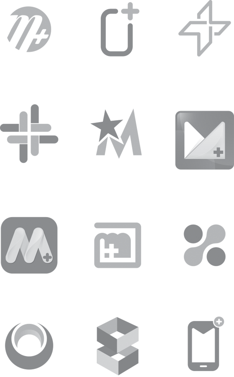
So how can we transform a brand image to match the fast-paced world , while still appealing to the casual user? Because let’s face it, overcomplicating things can get pretentious really quick. Seeing a line that thin needed a Fisheye, luckily Mobile Plus found us.


After much work done by our research team, we instantly realized that a radical change was needed, while of course keeping original identity preserved. Therefore, the logo was reborn by gathering the brand attributes into a single concept.
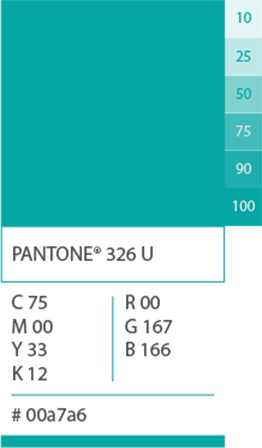
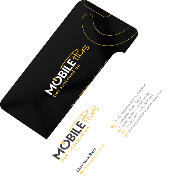
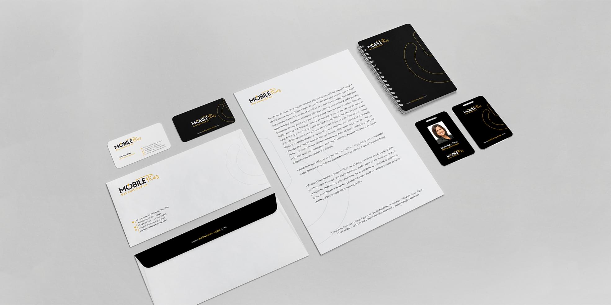
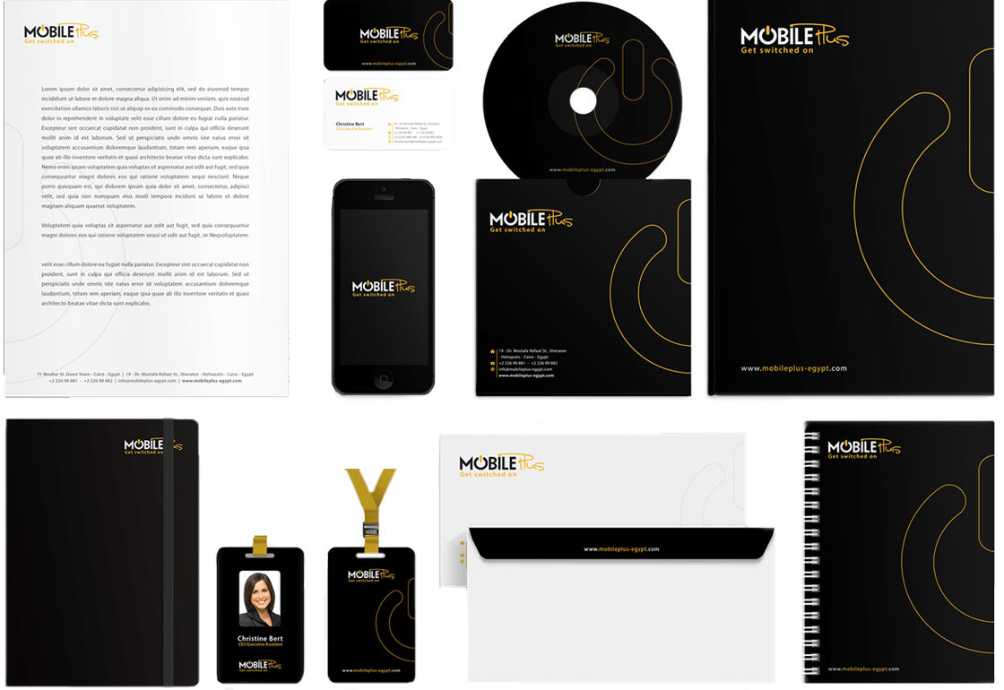
Since the company desired to leave its mark in the MENA region, we chose black and yellow for the colour palette to symbolize energy and at the same time to alert the competitors in the industry.
The message was that Mobile Plus is coming bigger and stronger than ever, we can proudly say that the message was delivered successfully.
We quickly found a few promising directions. Next, we spent time exploring a few selected directions, testing them to make sure our final decision was justified.