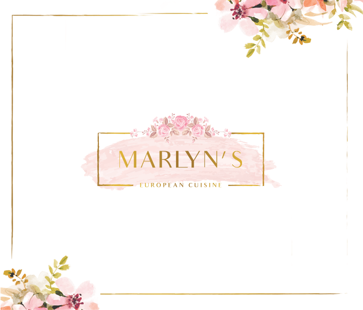
Marlyn's is a new, chic induced spot bringing you joyful picks of the best European cuisine dishes. They provide an exceptional experience for those who seek excellence & class in every bite.


There are those who go to a restaurant to experience its unique taste, while others are in it for the top-notch service and welcoming vibes, then there are those who want the best of both worlds.
Marlyn wanted to bring this unique blend home and we instantly geared up and started looking for a way to do so.
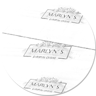
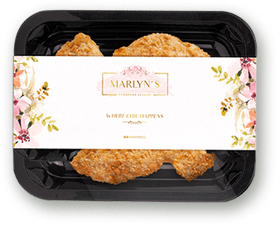
Wide lips, luminous eyes; it is how you react when you taste a well-cooked plate, this euphoric state had to be evident in our designs.
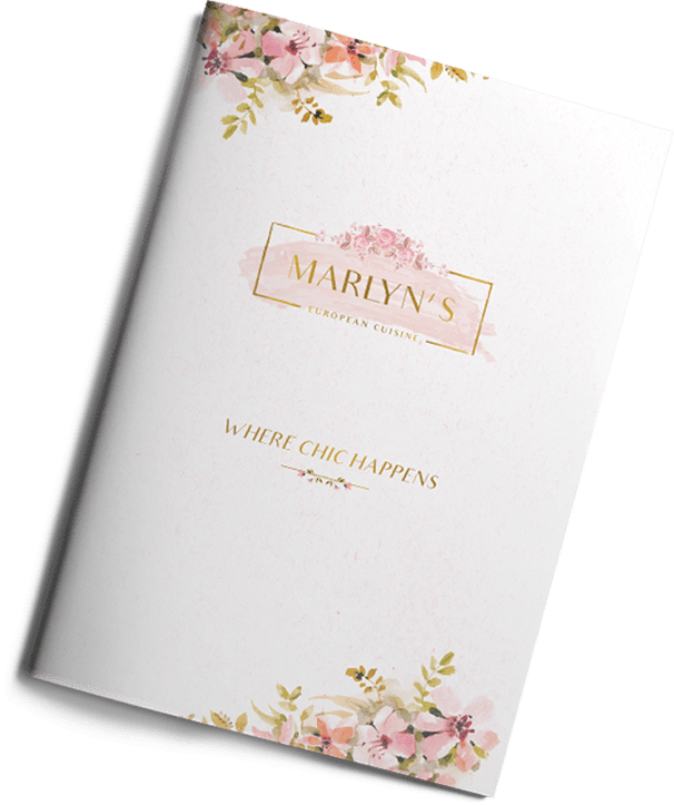
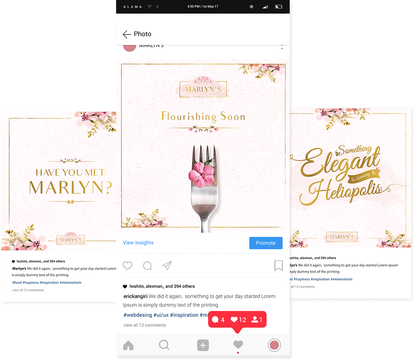
Through our thought process, we agreed that we are putting the “classy vibe” at the centre, and shining a light on this aspect is significant for the restaurant’s overall mood. Therefore, we went for the floral design, because It resonates the elegance and the ambiance that the restaurant desires to maintain.
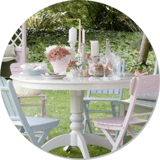
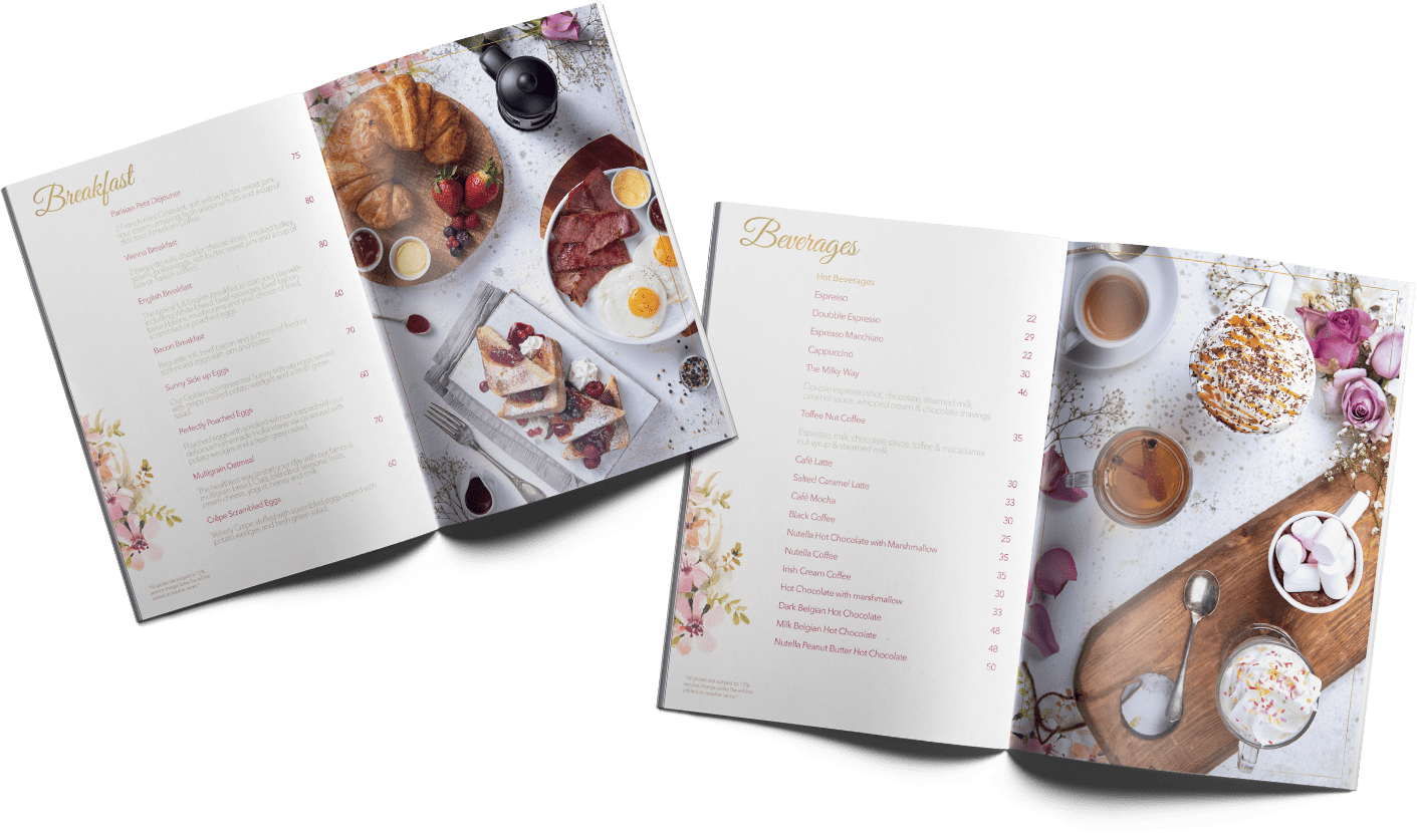
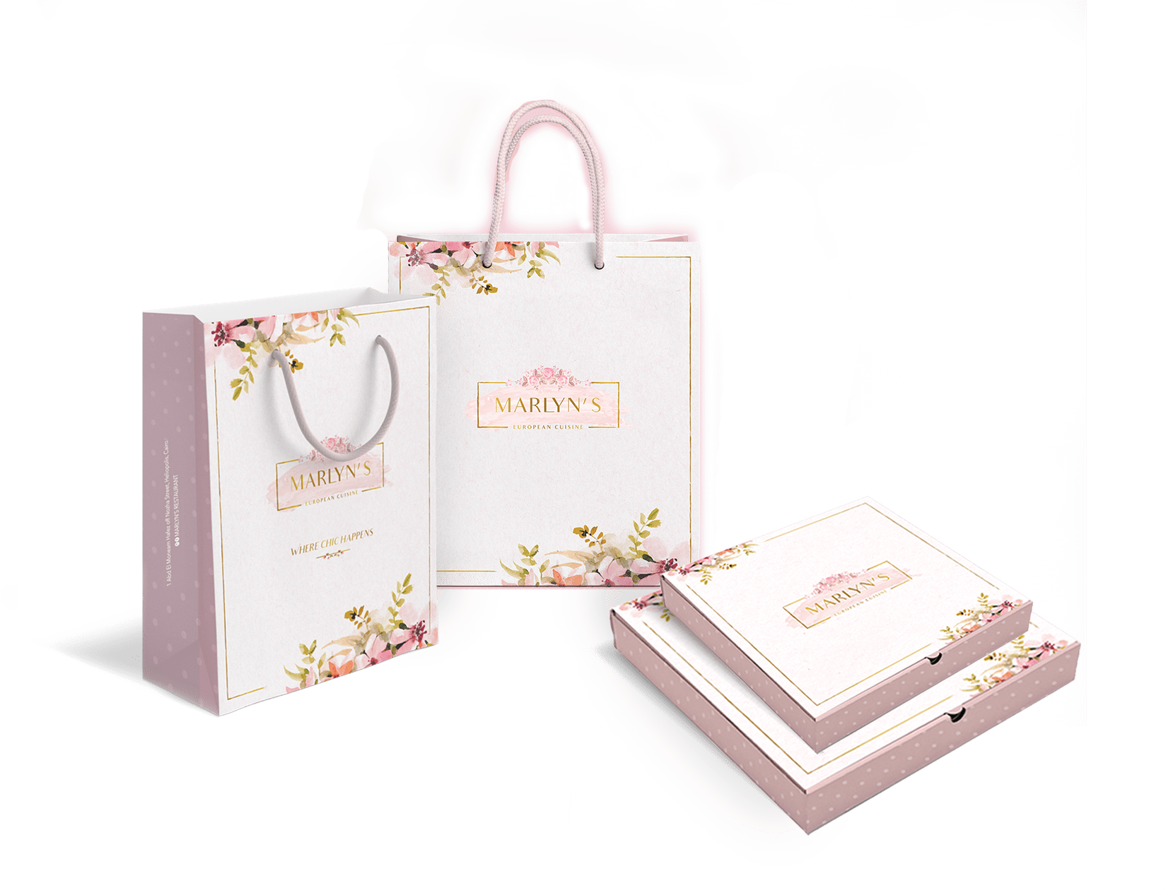
As per our usual wide perspective, we implemented the floral design among all their menus, photography and social media. Everything had to look pleasing; when hunger strikes, we often eat with our eyes, right?


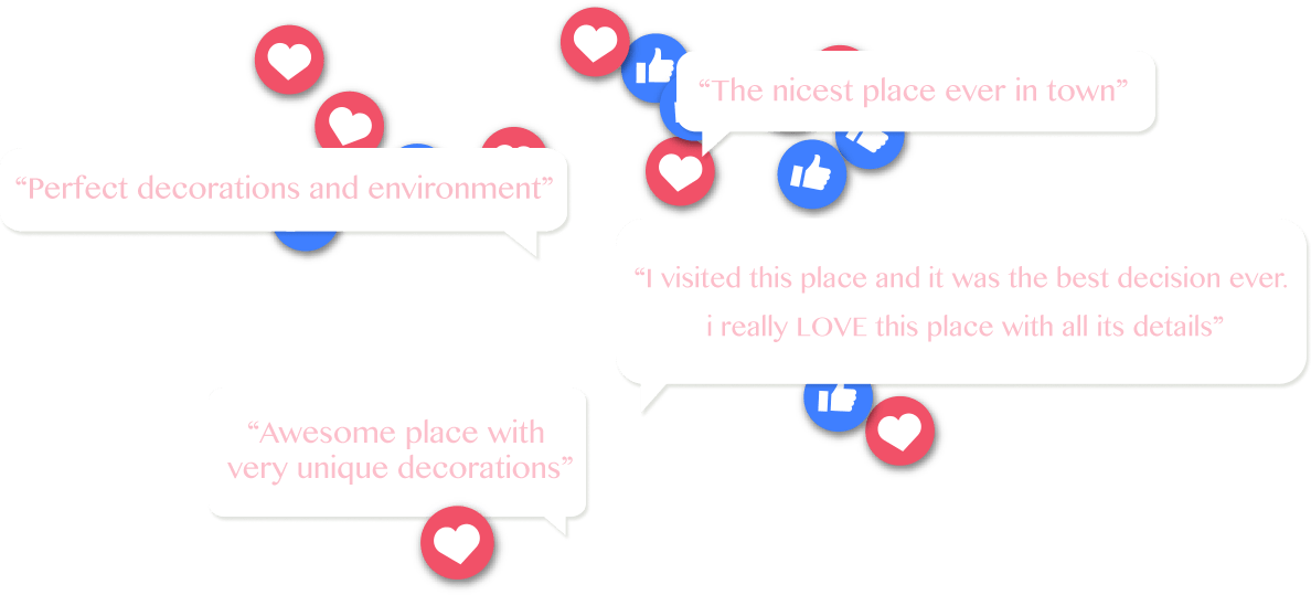
The floral essence became the talk of the town, and the feedback was full of customers striving to hit the seats of the restaurant again. We have also gathered a sample of the customer’s feedback, and we’ve noticed that their experience in the restaurant matched the brand Fisheye advertised.