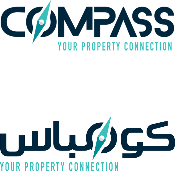
Compass is a real estate brokerage company founded in 2015, covering real estate all over Egypt as well as other Arab and international markets working in houses, offices and real estate investment. Compass offers real estate counseling services to their clients without any extra costs. Their services include consultations in housing, offices and investing in real estate sectors. Their services depend on direct interactions in which smart analysis tools are used according to a strategic vision.
The real estate market is getting more and more competitive every day, to get Compass to stand out in this packed market, a unique and distinctive personality was needed, but not at the cost of the subtlety and elegance you’d expect from a big and reliable name in the real estate market.
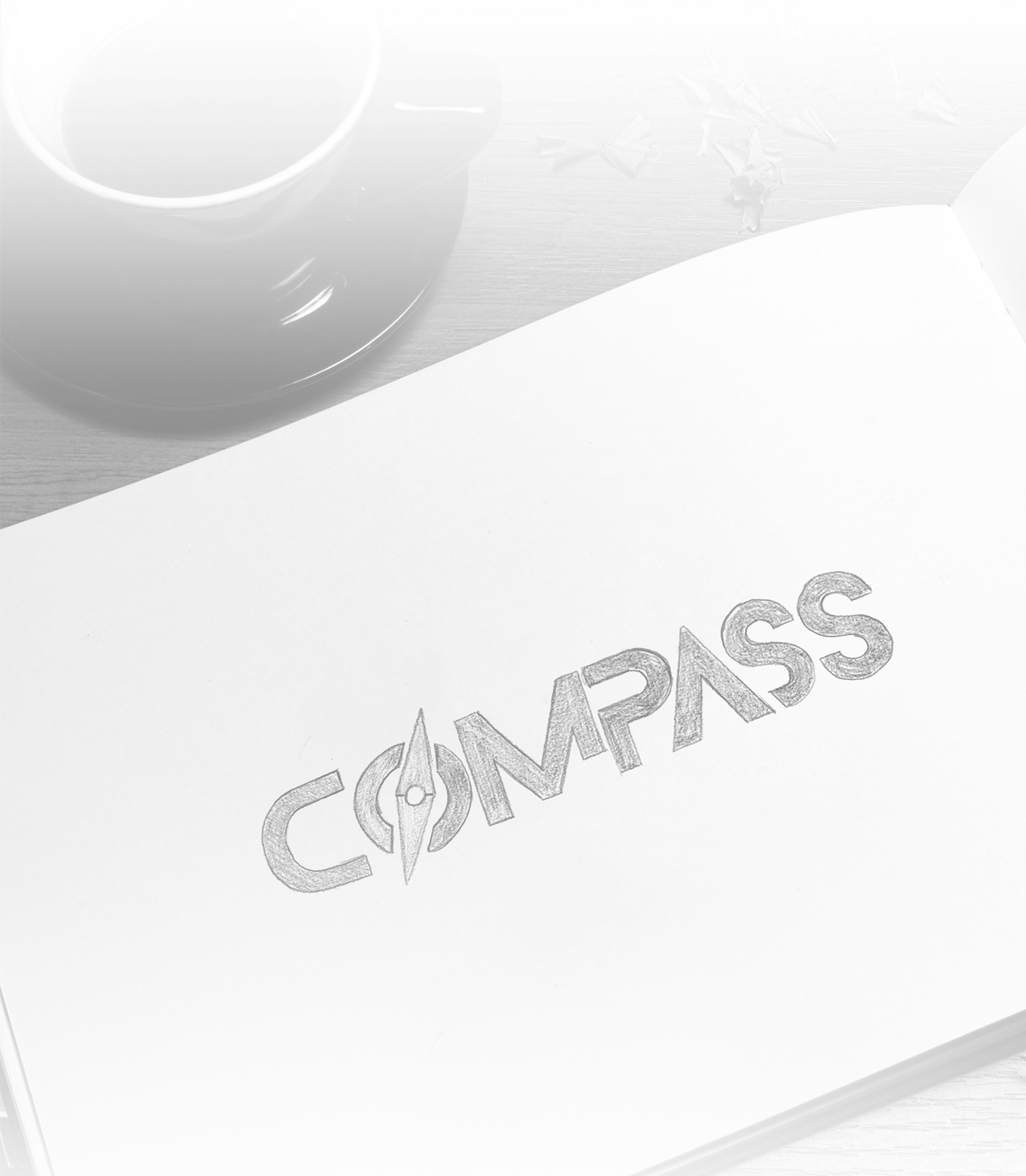
We also came up with few promising directions for the logo and testing each one to make sure our final decision was justified.
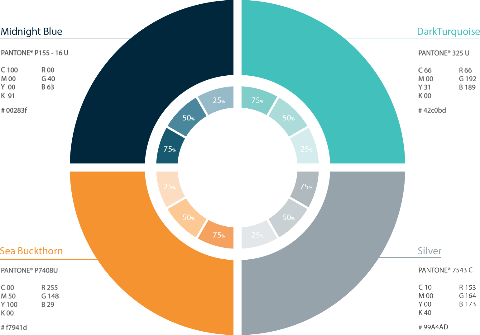
there are 2 cases in which we can use the orange color.
1-You can use it in the footer line in presentations
2-Also you can use it to highlight any text or information to give importance to it.
Latin typeface

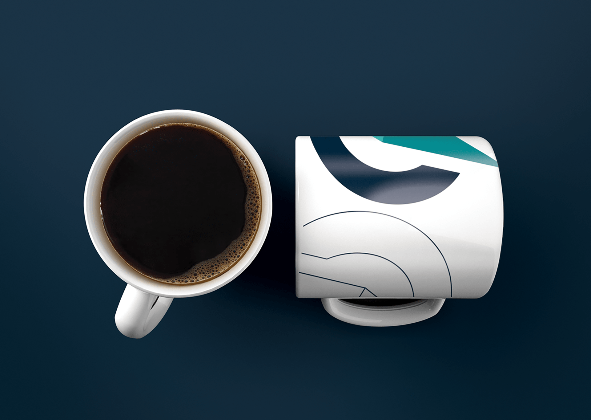
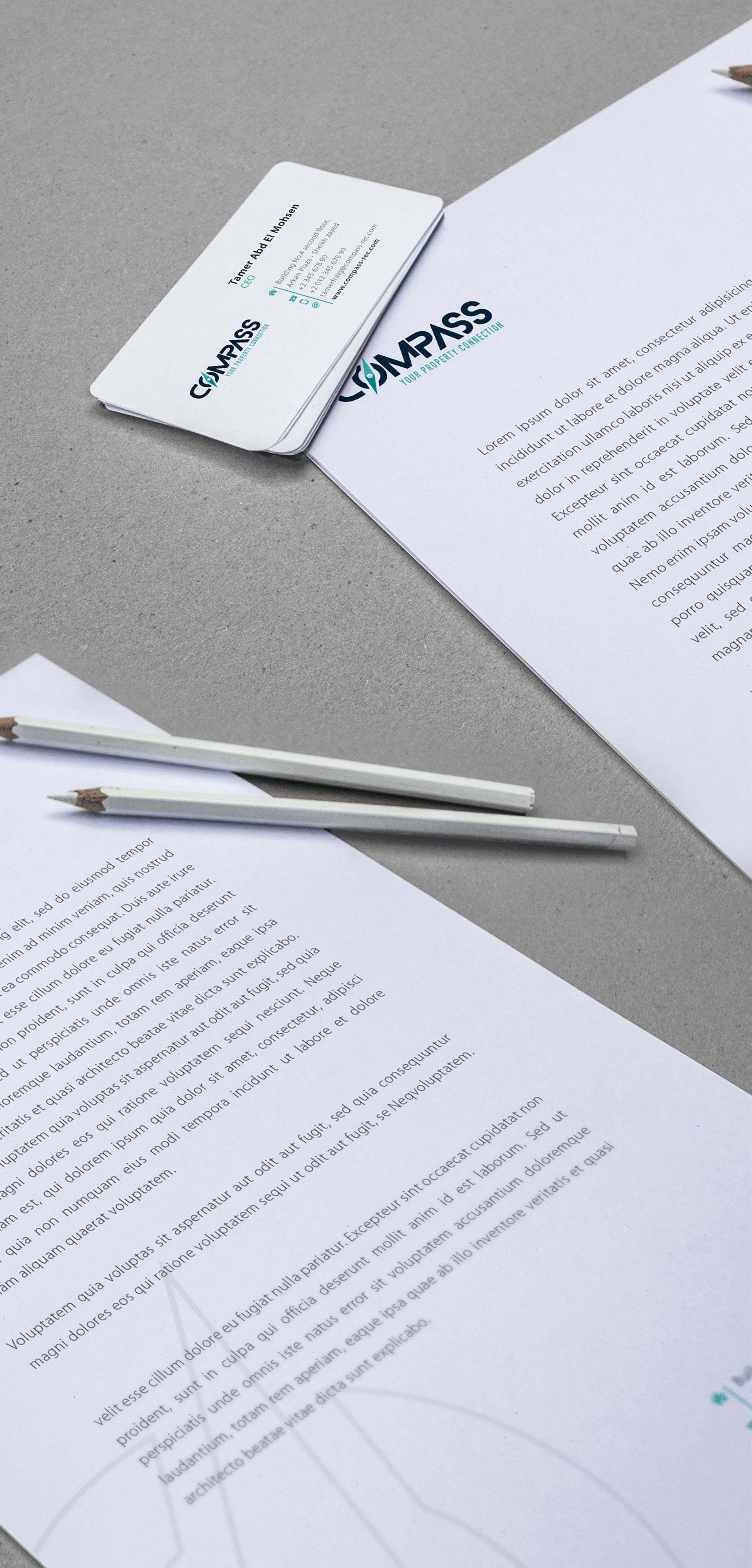

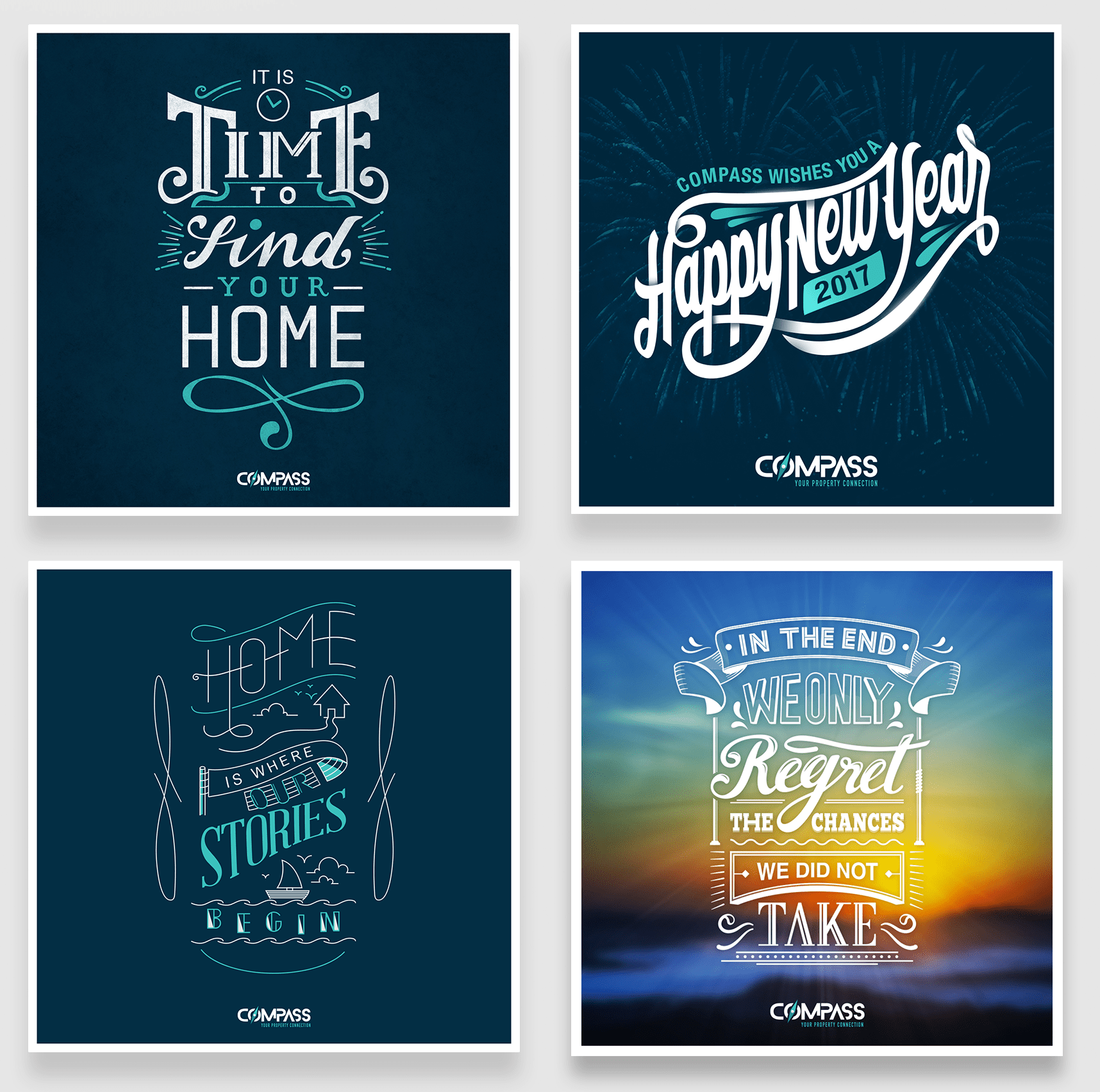
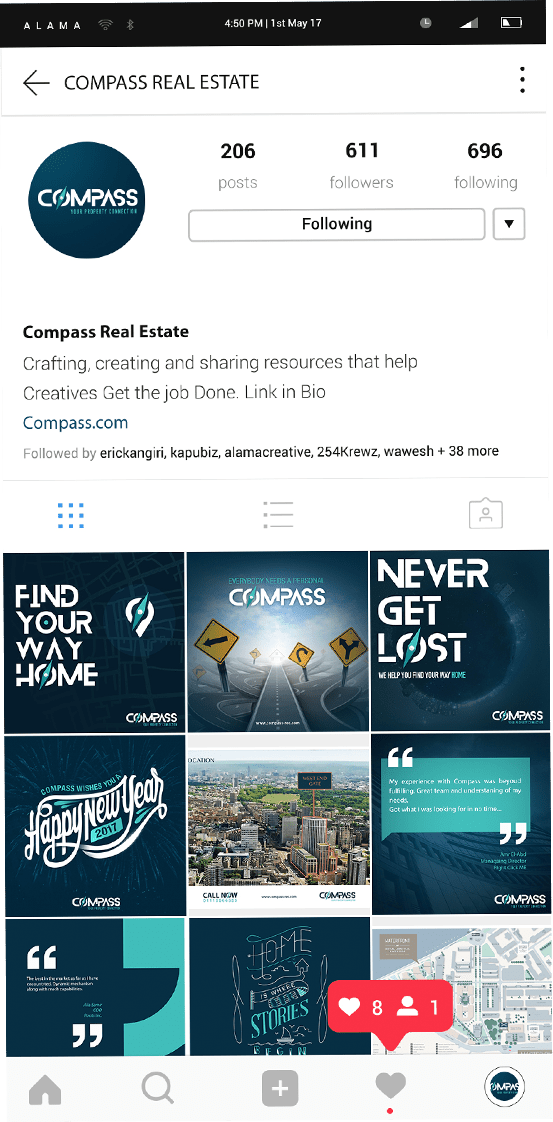
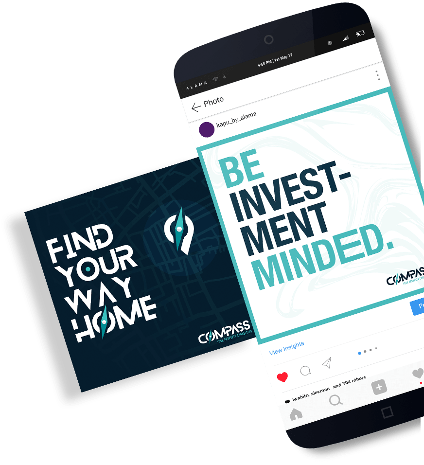
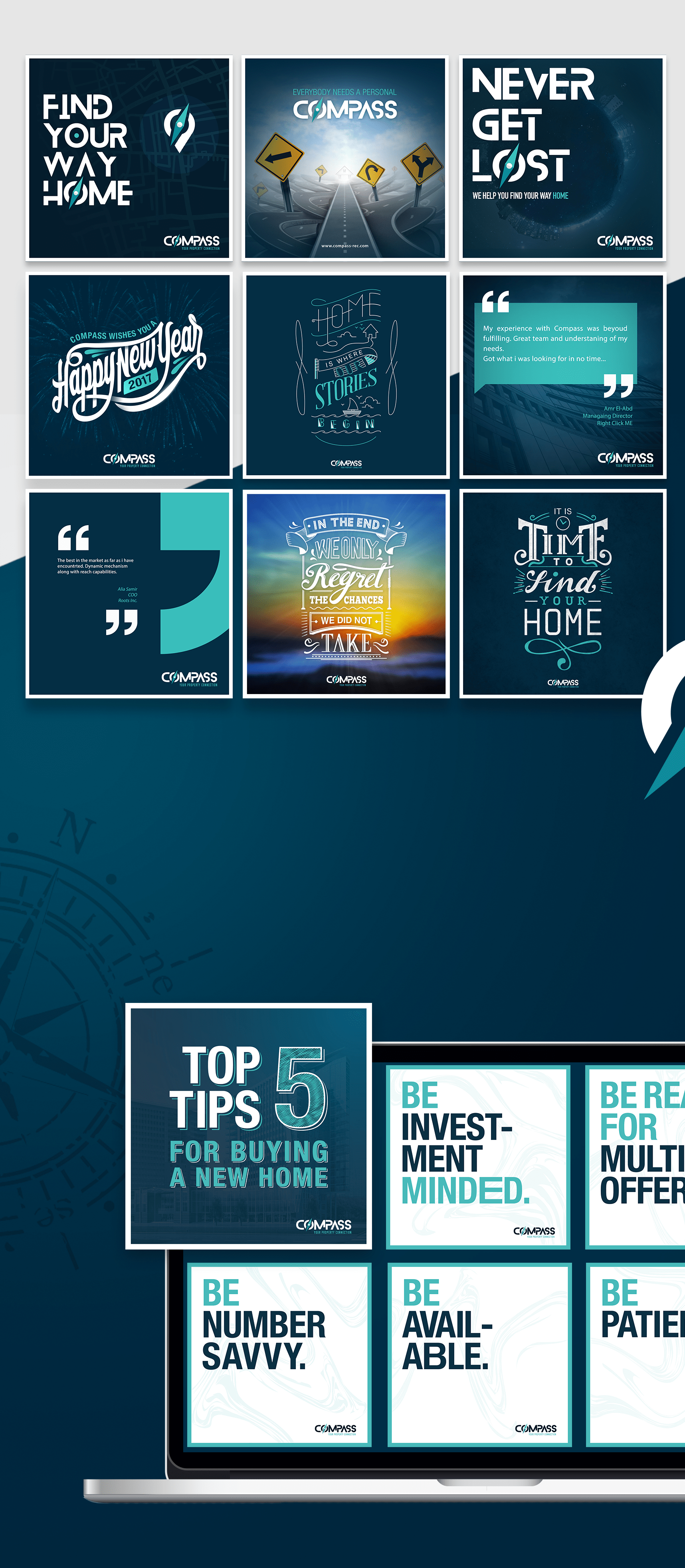

We managed to show Compass for what it really is, an original in a market full of copies. The reach of the company significantly improved.
And last but not least, Compass reached its goal which is helping all those that are looking for properties finding their guidance in the shape of a company that they can trust.
Mission Accomplished